Qt-Advanced-Docking-System
User Guide
- Configuration Flags
- Setting Configuration Flags
ActiveTabHasCloseButtonDockAreaHasCloseButtonDockAreaCloseButtonClosesTabOpaqueSplitterResizeXmlAutoFormattingEnabledXmlCompressionEnabledTabCloseButtonIsToolButtonAllTabsHaveCloseButtonRetainTabSizeWhenCloseButtonHiddenDragPreviewIsDynamicDragPreviewShowsContentPixmapDragPreviewHasWindowFrameAlwaysShowTabsDockAreaHasUndockButtonDockAreaHasTabsMenuButtonDockAreaHideDisabledButtonsDockAreaDynamicTabsMenuButtonVisibilityFloatingContainerHasWidgetTitleFloatingContainerHasWidgetIconHideSingleCentralWidgetTitleBarFocusHighlightingEqualSplitOnInsertionFloatingContainerForceNativeTitleBar(Linux only)FloatingContainerForceQWidgetTitleBar(Linux only)MiddleMouseButtonClosesTabDisableTabTextElidingShowTabTextOnlyForActiveTabDoubleClickUndocksWidgetTabsAtBottomUseNativeWindowsDisableStyleheet
- Auto Hide Dock Widgets
- Auto-Hide Configuration Flags
- Setting Auto-Hide Flags
AutoHideFeatureEnabledDockAreaHasAutoHideButtonAutoHideButtonTogglesAreaAutoHideButtonCheckableAutoHideSideBarsIconOnlyAutoHideShowOnMouseOverAutoHideCloseButtonCollapsesDockAutoHideHasCloseButtonAutoHideHasMinimizeButtonAutoHideOpenOnDragHoverAutoHideCloseOnOutsideMouseClick
- DockWidget Feature Flags
- Central Widget
- Empty Dock Area
- Custom Close Handling
- Globally Lock Docking Features
- Dock Widget Size / Minimum Size Handling
- Styling / themes
- Using ADS on Linux
- OpenGl + ADS
Configuration Flags
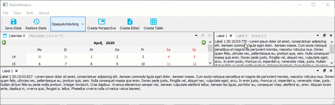
The Advanced Docking System has a number of global configuration options to configure the design and the functionality of the docking system. Each configuration will be explained in detail in the following sections.
Setting Configuration Flags
You must set the configuration flags before creating the dock manager instance otherwise the manager will not be created correctly and will crash upon being created. That means, setting the configurations flags is the first thing you must do, if you use the library.
CDockManager::setConfigFlags(CDockManager::DefaultOpaqueConfig);
CDockManager::setConfigFlag(CDockManager::RetainTabSizeWhenCloseButtonHidden, true);
...
d->DockManager = new CDockManager(this);
If you set the configurations flags, you can set individual flags using the
function CDockManager::setConfigFlag or you can set all flags using
the function CDockManager::setConfigFlags. Instead of settings all
flags individually, it is better to pick a predefined set of configuration
flags and then modify individual flags. The following predefined
configurations are available
DefaultNonOpaqueConfig- uses non opaque splitter resizing and non opaque dockingDefaultOpaqueConfig- uses opaque splitter resizing and opaque docking
Pick one of those predefined configurations and then modify the following configurations flags to adjust the docking system to your needs.
ActiveTabHasCloseButton
If this flag is set (default configuration), the active tab in a tab area has a close button.
If this flag is cleared, the active tab has no close button. You can combine
this with the flag DockAreaCloseButtonClosesTab to use the close button
of the dock are to close the single tabs.
DockAreaHasCloseButton
If the flag is set (default configuration) each dock area has a close button.
If this flag is cleared, dock areas do not have a close button.
DockAreaCloseButtonClosesTab
If the flag is set, the dock area close button closes the active tab, if not set, it closes the complete dock area (default).
OpaqueSplitterResize
The advanced docking system uses standard QSplitters as resize separators and thus supports opaque and non-opaque resizing functionality of QSplitter. In some rare cases, for very complex widgets or on slow machines resizing via separator on the fly may cause flicking and glaring of rendered content inside a widget. This global dock manager flag configures the resizing behaviour of the splitters. If this flag is set, then widgets are resized dynamically (opaquely) while interactively moving the splitters. If you select the predefined configuration DefaultOpaqueConfig, then this is the configured behaviour.
If this flag is cleared, the widget resizing is deferred until the mouse button is released - this is some kind of lazy resizing separator. If you select the predefined
configuration DefaultNonOpaqueConfig, then this is the configured behaviour.
XmlAutoFormattingEnabled
If enabled, the XML writer automatically adds line-breaks and indentation to empty sections between elements (ignorable whitespace). This is used, when the current state or perspective is saved. It is disabled by default.
XmlCompressionEnabled
If enabled, the XML output will be compressed and is not human readable anymore. This ie enabled by default to minimize the size of the saved data.
TabCloseButtonIsToolButton
If enabled the tab close buttons will be QToolButtons instead of QPushButtons -
disabled by default. Normally the default configuration should be ok but if your
application requires QToolButtons instead of QPushButtons for styling reasons
or for any other reasons, then you can enable this flag.
AllTabsHaveCloseButton
If this flag is set, then all tabs that are closable show a close button. The advantage of this setting is that the size of the tabs does not change and the user can immediately close each tab. The disadvantage is that all tabs take up more space.
If this flas is cleared, then only the active tab has a close button (default) and therefore the tabs need less space.
RetainTabSizeWhenCloseButtonHidden
If this flag is set, the space for the close button is reserved even if the close button is not visible. This flag is disabled by default. If this flag is disabled, the tab size dynamically changes if the close button is visible / hidden in a tab. If this flag is enabled, the tab size always remains constant, that means, if enabled, the tabs need more space.
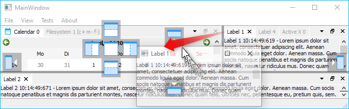
DragPreviewIsDynamic
If non-opaque undocking is enabled, this flag defines the behavior of the drag
preview window. If this flag is enabled, then it will give the user the
impression, that the floating drag preview is dynamically adjusted to the drop
area. In order to give the perfect impression, you should disable the flags
DragPreviewShowsContentPixmap and DragPreviewHasWindowFrame.
CDockManager::setConfigFlag(CDockManager::DragPreviewIsDynamic, true);
CDockManager::setConfigFlag(CDockManager::DragPreviewShowsContentPixmap, false);
CDockManager::setConfigFlag(CDockManager::DragPreviewHasWindowFrame, false);
DragPreviewShowsContentPixmap
If non-opaque undocking is enabled, the created drag preview window shows a copy of the content of the dock widget / dock are that is dragged, if this flag is enabled (default).
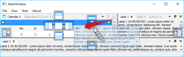
If this flag is disabled, the drag preview is only a transparent QRubberBand
like window without any content.
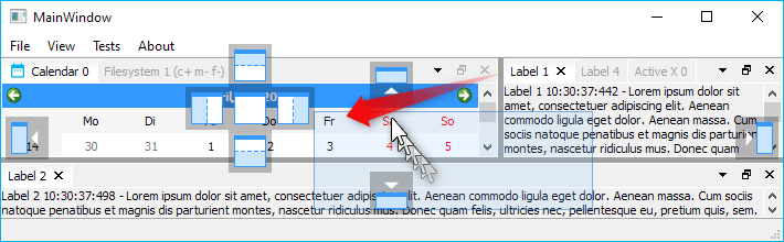
DragPreviewHasWindowFrame
If non-opaque undocking is enabled, then this flag configures if the drag preview is frameless (default) or looks like a real window. If it is enabled, then the drag preview is a transparent window with a system window frame.
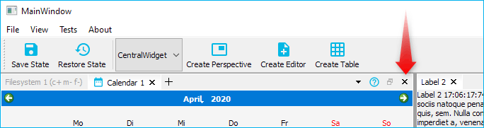
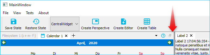
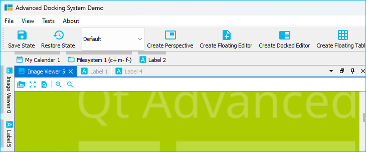
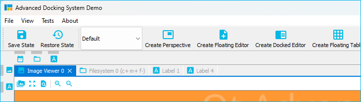
AlwaysShowTabs
If this option is enabled, the tab of a dock widget is always displayed - even if it is the only visible dock widget in a floating widget. In the image below on the left side, the flag is disabled (default) and on the right side it is enabled.
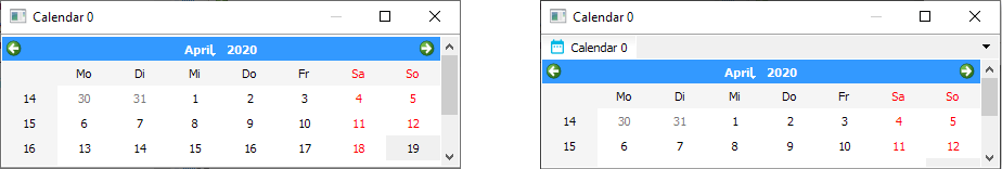
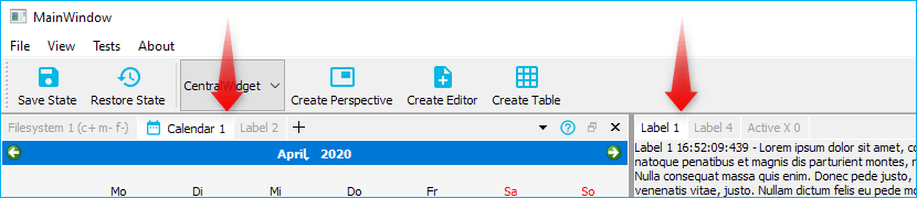
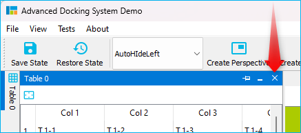
DockAreaHasUndockButton
If the flag is set (default) each dock area has an undock button (right image). If the flag is cleared, a dock area has no undock button (left image)
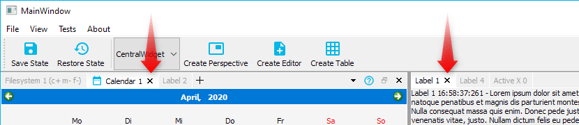
DockAreaHasTabsMenuButton
Tabs are a good way to quickly switch between dockwidgets in a dockarea. However, if the number of dockwidgets in a dockarea is too large, this may affect the usability of the tab bar. To keep track in this situation, you can use the tab menu. The menu allows you to quickly select the dockwidget you want to activate from a drop down menu. This flag shows / hides the tabs menu button in the dock area title bar. On the left side, the tabs menu button flag is cleared.
DockAreaHideDisabledButtons
If certain flags of a dock widget are disabled, like DockWidgetClosable or
DockWidgetFloatable, then the corresponding dock area buttons like close
button or detach button are disabled (greyed out). This is the default
setting.
If the flag is set, disabled dock area buttons will not appear on the toolbar at all - they are hidden.
DockAreaDynamicTabsMenuButtonVisibility
If this flag is cleared, the the tabs menu button is always visible. This is the default setting. If the flag is set, the tabs menu button will be shown only when it is required - that means, if the tabs are elided.
If the tabs are not elided, the tabs menu button is hidden.
FloatingContainerHasWidgetTitle
If set (default), the floating widget window title reflects the title of the current dock widget.
otherwise it displays the title set with CDockManager::setFloatingContainersTitle or
application name as window title.
FloatingContainerHasWidgetIcon
If set, the floating widget icon reflects the icon of the current dock widget
otherwise (default setting) it displays application icon.
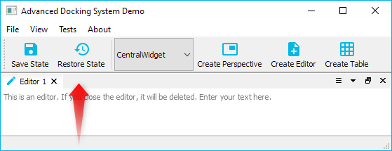
HideSingleCentralWidgetTitleBar
If there is only one single visible dock widget in the main dock container (the dock manager) and if this flag is set, then the titlebar of this dock widget will be hidden. This only makes sense for non draggable and non floatable dock widgets and enables the creation of some kind of “central” static widget. Because the titlebar is hidden, it is not possible to drag out the central widget to make it floating or to close it via the close button.
Unless a central widget explicitly has been set with setCentralWidget, the Advanced Docking System is without a static central widget and it wouldn’t know about a central static widget. Therefore this flag is disabled by default and a central single dock widget still has a titlebar to drag it out of the main window.
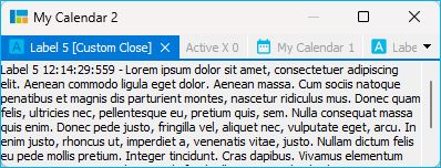
FocusHighlighting
If this is enabled, the docking system is able to highlight the tab and the components of a dock area with a different style (i.e. a different color). This option is disabled by default and needs to be enabled explicitly because it adds some overhead. The dock manager needs to react on focus changes and dock widget dragging to highlight the right dock widget. You should enable it only, if you really need it for your application.
If the feature is enabled, you can also connect to the new dock manager
signal focusedDockWidgetChanged(CDockWidget* old, CDockWidget* now) to
react on focus changes and to prepare the content of the focused dock
widget.
You can click into the tab, the titlebar or the content of a dock widget to focus it.
For the focused dock widget and dock widget tab, the property focused will
be set to true and you can use this property to style the focused dock
widget differently. The picture above uses the following styling:
/* Color the tab with the highlight color */
ads--CDockWidgetTab[focused="true"]
{
    background: palette(highlight);
    border-color: palette(highlight);
}

/* Use a different colored close button icon to match the test color */
ads--CDockWidgetTab[focused="true"] > #tabCloseButton
{
	qproperty-icon: url(:/ads/images/close-button-focused.svg)
}

/* Make a hovered focused close button a little bit lighter */
ads--CDockWidgetTab[focused="true"] > #tabCloseButton:hover
{
	background: rgba(255, 255, 255, 48);
}

/* Make a pressed focused close button even more lighter */
ads--CDockWidgetTab[focused="true"] > #tabCloseButton:pressed
{
	background: rgba(255, 255, 255, 92);
}

/* Use a different color for the tab label */
ads--CDockWidgetTab[focused="true"] QLabel
{
    color: palette(light);
}

/* Paint a nice solid line for the whole title bar to create the illusion
   of an active tab */
ads--CDockAreaWidget[focused="true"] ads--CDockAreaTitleBar
{
	background: transparent;
	border-bottom: 2px solid palette(highlight);
	padding-bottom: 0px;
}
If you have a content widget that does not support focussing for some reason
(like QVTKOpenGLStereoWidget from the VTK library),
then you can manually switch the focus by reacting on mouse events. The
following code shows, how to install en event filter on the QVTKOpenGLStereoWidget
to properly switch the focus on QEvent::MouseButtonPress:
static ads::CDockWidget* createVTK2DWindow(QMenu* ViewMenu, QObject* EventFilter)
{
    QVTKOpenGLStereoWidget* qvtkOpenGLStereoWidget = new QVTKOpenGLStereoWidget;
    ads::CDockWidget* DockWidget = new ads::CDockWidget("2D Window");
    DockWidget->setWidget(qvtkOpenGLStereoWidget);
    qvtkOpenGLStereoWidget->installEventFilter(EventFilter);
    qvtkOpenGLStereoWidget->setProperty("DockWidget", QVariant::fromValue(DockWidget));
    return DockWidget;
}
Now we can use the event filter function to react on mouse events and then
use the dock manager function setDockWidgetFocused() to switch the focus:
bool CMainWindow::eventFilter(QObject *watched, QEvent *event)
{
    if (event->type() == QEvent::MouseButtonPress)
    {
        QVTKOpenGLStereoWidget* vtkWidget =  qobject_cast<QVTKOpenGLStereoWidget*>(watched);
        auto vDockWidget = vtkWidget->property("DockWidget");
        ads::CDockWidget* DockWidget = nullptr;
        if (vDockWidget.isValid())
        {
            DockWidget = qvariant_cast<ads::CDockWidget*>(vDockWidget);
        }

        if (DockWidget)
        {
            d->DockManager->setDockWidgetFocused(DockWidget);
        }
    }
    return false;
}
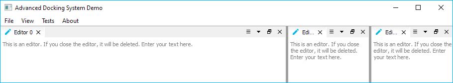
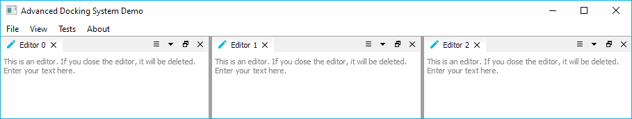
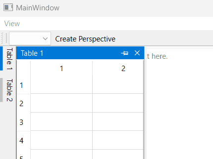
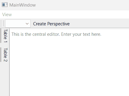
EqualSplitOnInsertion
This flag configures how the space is distributed if a new dock widget is inserted into an existing dock area. The flag is disabled by default. If 3 dock widgets are inserted with the following code
d->DockManager->addDockWidget(ads::RightDockWidgetArea, DockWidget, EditorArea);
then this is the result, if the flag is disabled:
If the flag is enabled, then the space is equally distributed to all widgets in a splitter:
FloatingContainerForceNativeTitleBar (Linux only)
Since release 3.6 the library supports native title bars and window decorations for floating widgets on Linux (thanks to a user contribution). Native title bars and window decorations are supported by most Linux window managers, such as Compiz or Xfwm. Some window managers like KWin do not properly support this feature. Native floating widgets look better because of the native styling and the support all window manager features like snapping to window borders or maximizing. The library tries to detect the window manager during runtime and activates native window decorations if possible:
If you would like to overwrite this autodetection, then you can activate this
flag to force native window titlebars. You can overwrite autodetection and this
flag, if you set the environment variable ADS_UseNativeTitle to 0 or 1.
FloatingContainerForceQWidgetTitleBar (Linux only)
If your window manager (i.e. KWin) does not properly support native floating windows, the docking library falls back to QWidget based floating widget title bars.
If you would like to overwrite autodetection, then you can activate this flag
to force QWidget based title bars. You can overwrite autodetection and this
flag, if you set the environment variable ADS_UseNativeTitle to 0 or 1.
MiddleMouseButtonClosesTab
If the flag is set, the user can use the mouse middle button to close the tab under the mouse. So you do not need to exactly hit the tab close button to close tab. Just click with the middle mouse button on a tab like this is possible in various web browsers.
DisableTabTextEliding
Set this flag to disable eliding of tab texts in dock area tabs:
The flag is disabled by default and the text in all tabs is elided to show as many tabs as possible even if there is not much space:
ShowTabTextOnlyForActiveTab
Set this flag (default = false) to show label texts in dock area tabs only for active tabs. Inactive tabs only show their icon:
DoubleClickUndocksWidget
If the flag is set (default), a double click on a tab undocks the dock widget. If you would like to disable undocking, just clear this flag.
TabsAtBottom
If the flag is set, tabs will be shown at the bottom instead of in the title bar.
UseNativeWindows
If the flag is set, windows for the dock and area widgets will be native on Windows OS. It is disabled by default.
DisableStyleheet
If the flag is set, the dock manager will not apply the default stylesheet. You can enable this flag, if you want to use your own stylesheet.
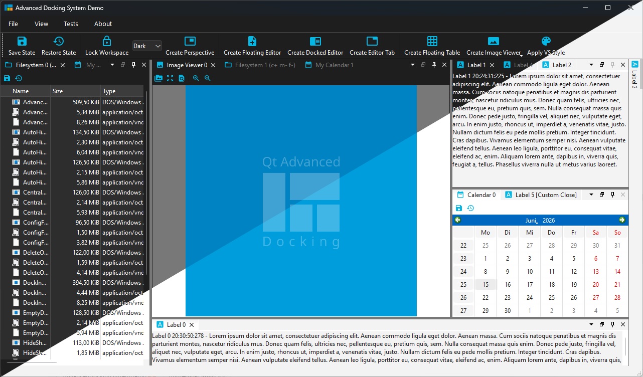
Auto Hide Dock Widgets
The Advanced Docking System supports “Auto-Hide” functionality for all dock containers. The “Auto Hide” feature allows to display more information using less screen space by hiding or showing windows pinned to one of the four dock container borders.
Enabling this feature adds a button with a pin icon to each dock area.
By clicking this button, the current dock widget (or the complete area - depending on the configuration flags) will be pinned to a certain border. The border is chosen depending on the location of the dock area. If you click the pin button while holding down the Ctrl key, the whole dock area will be pinned to a certain border.
Pinning Auto-Hide Widgets to a certain border
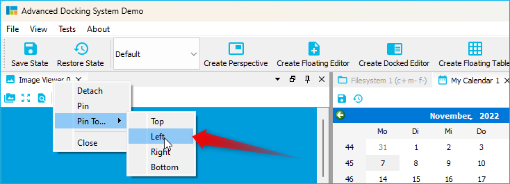
If you would like to pin a dock widget or a dock area to a certain border, then you can right-click into the dock widget tab or into the dock area title bar to show the context menu. Then you can select the location via the Pin to menu:
Show / Hide Auto-Hide Widgets via Mouse Over
Normally Auto-Hide widgets are shown by clicking the Auto-Hide tab and hidden by
clicking the Auto-Hide tab again or by clicking into any other dock widget in
the same container. If the Auto-Hide config flag AutoHideShowOnMouseOver is set,
the Auto-Hide widget is shown, if the user hovers over the Auto-Hide tab and is
collapsed if the mouse cursor leaves the Auto-Hide widget. Showing and hiding
by mouse click still works if this feature is enabled.
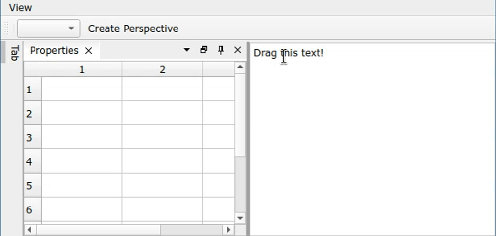
Drag & Drop to Auto-Hide
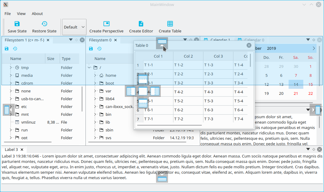
You can easily drag any dock widget or any floating widget to the borders of a window to pin it as a auto-hide tab in one of the 4 sidebars. If you drag a dock widget close the one of the four window borders, special drop overlays will be shown to indicate the drop area for auto-hide widgets:
Of course, this also works with dock areas:
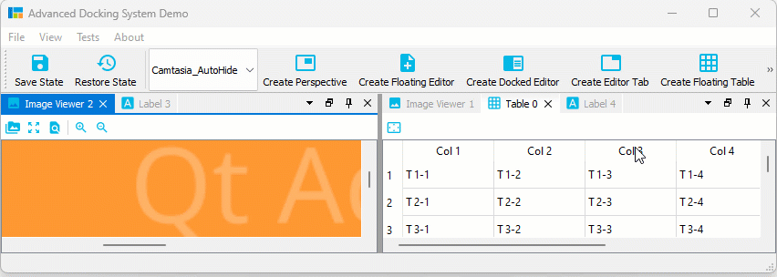
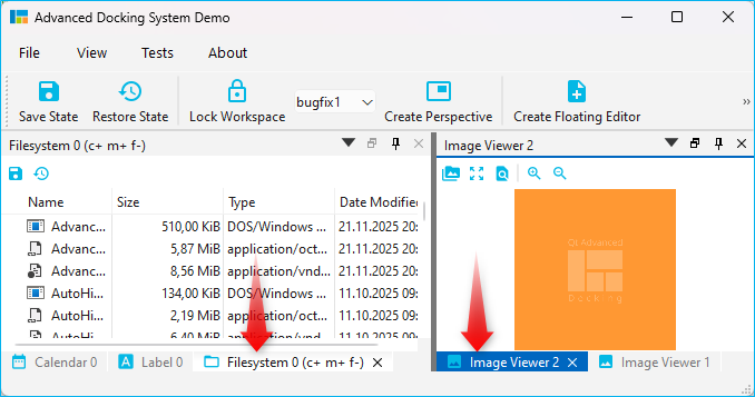
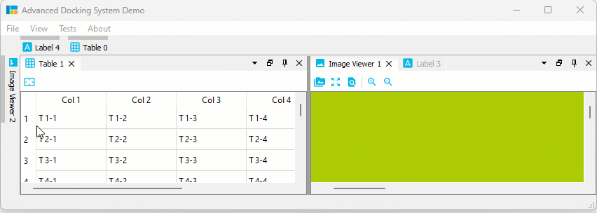
If you drag a dock widget or dock area into a sidebar, then you even have control over where tabs are inserted. Simply drag your mouse over a specific auto-hide tab, and your dragged dock widget will be inserted before this tab. Drag to the sidebar area behind the last tab, and the dragged widget will be appended as last tab. In the following screen capture, the Image Viewer 1 will be inserted before the Table 0 Auto-Hide tab and the Image Viewer 2 is appended behind the last tab:
Auto-Hide Tab Insertion Order
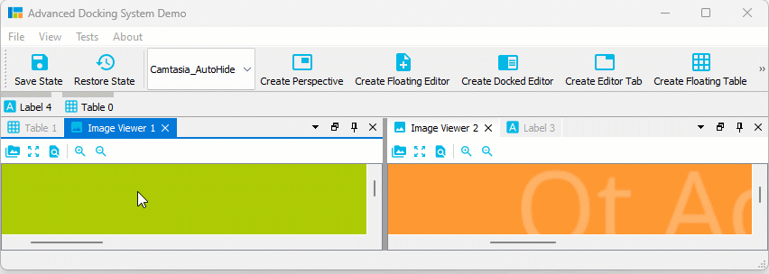
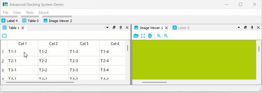
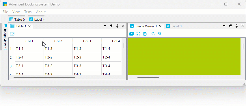
It is also possible to drag Auto-Hide tabs to a new auto-hide position. That means, you can drag them to a different border or sidebar:
Auto-Hide Tab Sorting
You can drag Auto-Hide tabs to a new position in the current sidebar to sort them:
Auto-Hide Drag to Float / Dock
But that is not all. You can also simply move Auto-Hide tabs to another floating widget or dock them via drag and drop:
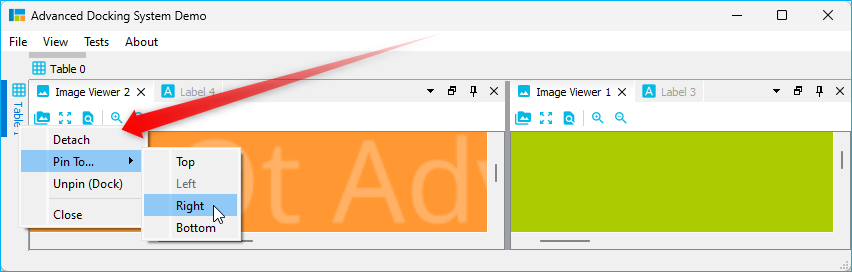
Auto-Hide Context Menu
All Auto-Hide tabs now have a context menu, that provides all the functionality that you know from Dock widget tabs. With the Pin To… item from the context menu it is very easy to move an Auto-Hide tab to a different Auto-Hide sidebar:
Adding Auto Hide Widgets
Adding an auto hide widget is similar to adding a dock widget, simply call
dockManager->addAutoHideDockWidget().
CDockManager::setAutoHideConfigFlags(CDockManager::DefaultAutoHideConfig);
d->DockManager = new CDockManager(this);
CDockWidget* TableDockWidget = new CDockWidget("Table 1");
DockManager->addAutoHideDockWidget(SideBarLeft, TableDockWidget);
Preferred Aut Hide Sidebar Location
By default, docking a widget to auto-hide determines the target sidebar based on the widget’s current geometry. While this works well for most layouts, applications with fixed panel arrangements may prefer explicit control over the sidebar placement.
Use setPreferredAutoHideSideBarLocation() to specify the preferred auto-hide sidebar for a dock widget:
dockWidget->setPreferredAutoHideSideBarLocation(SideBarLeft);
When a preferred location is set, the widget is always pinned to the specified sidebar instead of using geometry-based detection. The default value (SideBarNone) preserves the existing behavior.
When restoring (unpinning) a widget, the docking system also attempts to merge it into an existing dock area containing widgets with the same preferred sidebar location, avoiding unnecessary split areas and keeping related widgets grouped as tabs.
API
void setPreferredAutoHideSideBarLocation(SideBarLocation location); SideBarLocation preferredAutoHideSideBarLocation() const;
See autohide example or the demo application to learn how it works.
Auto-Hide Configuration Flags
Setting Auto-Hide Flags
The Advanced Docking System has a number of global configuration flags to configure the Auto-Hide functionality. You should set the Auto-Hide flags before creating the dock manager instance. That means, you should set the Auto-Hide flags after setting the configuration flags.
CDockManager::setConfigFlag(CDockManager::FocusHighlighting, true);
CDockManager::setAutoHideConfigFlags(CDockManager::DefaultAutoHideConfig);
CDockManager::setAutoHideConfigFlag(CDockManager::AutoHideShowOnMouseOver, true);
...
d->DockManager = new CDockManager(this);
If you set the Auto-Hide flags, you can set individual flags using the
function CDockManager::setAutoHideConfigFlag or you can set all flags using
the function CDockManager::setAutoHideConfigFlags. Instead of settings all
flags individually, it is better to pick a predefined set of configuration
flags and then modify individual flags. The following predefined
configurations are available
DefaultAutoHideConfig- default auto hide config
Pick one of those predefined configurations and then modify the following configurations flags to adjust the docking system to your needs.
AutoHideFeatureEnabled
Enables / disables the Auto-Hide functionality. Only if this flag is enabled, the other Auto-Hide flags will be evaluated.
DockAreaHasAutoHideButton
If this flag is set (default), then each dock area has a pin button in the title bar to toggle Auto-Hide state.
AutoHideButtonTogglesArea
If set, the the pin button in the dock area title bar toggles the complete area. If not set (default), then the pin button toggles the current active tab / dock widget and pressing the Ctrl key while clicking the pin button toggles the complete ara.
AutoHideButtonCheckable
Normally the pin button in the dock area title bar is not checkable. If this flag is set, then the button is checkable. That means, if button is checked, the dock widget is pinned.
AutoHideSideBarsIconOnly
Normally the Auto-Hide tabs show the icon and title of the dock widget:
You can set this flag, if you would like to have only icons in the Auto-Hide tabs instead of icon and dock widget title. If this is set, the Auto-Hide tab needs less space. The tooltip of each tab still shows the dock widget title.
AutoHideShowOnMouseOver
Normally Auto-Hide widgets are shown by clicking the Auto-Hide tab and hidden by clicking the Auto-Hide tab again or by clicking into any other dock widget in the same container. If this flag is set, the Auto-Hide widget is shown, if the user hovers over the Auto-Hide tab or if the users moves the mouse outside of the Auto-Hide widget. Showing and hiding my mouse click still works if this feature is enabled.
AutoHideCloseButtonCollapsesDock
Some users don’t understand the distinction between closing an auto hide dock and collapsing an auto hide dock. This may lead to situations where they press the close button (losing the side tab widget) instead of simply clicking outside the auto hide dock (collapsing the dock).
If AutoHideCloseButtonCollapsesDock option is active, the
close button in an auto hide widget collapses the auto hide widget instead of
closing it.
If you enable the AutoHideHasMinimizeButton flag, you should disable this
flag our you will have two buttons with minimize functionality.
AutoHideHasCloseButton
If this flag is set (default), then each auto hide widget has a close button:
The functionality of the close button (close or minimize) is configured by the
AutoHideCloseButtonCollapsesDock flag.
AutoHideHasMinimizeButton
If this flag is set (disabled by default), then each auto hide widget has a minimize button.
AutoHideOpenOnDragHover
If this flag is set (disabled by default), then holding a dragging cursor hover an auto-hide collapsed dock’s tab will open said dock:
Said dock must be set to accept drops to hide when cursor leaves its scope. See AutoHideDragNDropExample for more details.
AutoHideCloseOnOutsideMouseClick
If this flag is set (default), the auto hide dock container will collapse if the user clicks outside of the container. If not set, the auto hide container can be closed only via click on auto hide sidebar tab.
DockWidget Feature Flags
DockWidgetClosable
If set, the dock widget will have a close button.
DockWidgetMovable
If a dock widget is movable, then it and can be moved to a new position in the current dock container. Disable this flag to prevent moving of a dock widget via mouse.
DockWidgetFloatable
If set, a dock widget can be dragged into a floating window.
DockWidgetDeleteOnClose
Deletes the dock widget and its content when it is closed.
CustomCloseHandling
Clicking the close button will not close the dock widget but emits the
closeRequested() signal instead. This allows the application to implement
a custom close handling.
DockWidgetFocusable
If this is enabled, a dock widget can get focus highlighting.
DockWidgetForceCloseWithArea
A dock widget will be closed when the dock area hosting it is closed. If the
DockWidgetDeleteOnClose feature is enabled for a dock widget, then it will
be deleted, if the user clicks the close button of this dock widget. If the
user clicks the close button of the dock area that contains this widget,
then only the visibility of the dock widget is toggled. If this feature flag
is set, the closing the dock area also closes the dock widget. That means, if
the dock widget feature DockWidgetDeleteOnClose is set for the dock widgets
in a dock area, then all dock widgets will be deleted if the dock area is closed.
NoTab
A dock widget tab will never be shown if this flag is set.
DeleteContentOnClose
Deletes only the contained widget on close, keeping the dock widget intact and in place. Attempts to rebuild the contents widget on show if there is a widget factory set. See issue #365 for more details.
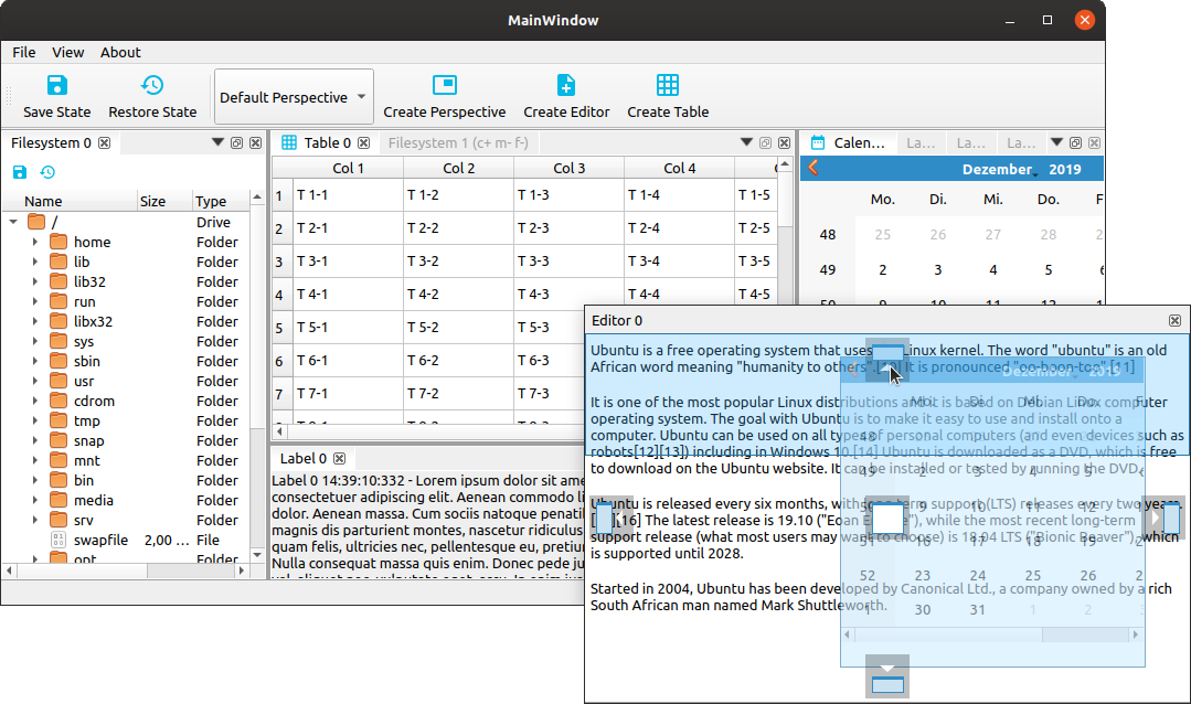
Central Widget
The Advanced Docking System has been developed to overcome the limitations of the native Qt docking system with its central widget concept. This was the reason that until version 3.6 of the library, there was no support for such thing like a central widget. Thanks to the contribution of a user the library now supports a central widget.
In the Advanced Docking System a central widget is a docking widget that is neither closable nor movable or floatable. A central widget has no title bar and so it is not possible for the user to hide, close or drag the central widget. If there is a central widget, then also the distribution of the sizes for the dock widgets around the central widget is different:
- no central widget (default) - on resizing the available space is distributed to all dock widgets - the size of all dock widgets shrinks or grows
- with central widget - on resizing only the central widget is resized - the dock widgets around the central widget keep their size (see the animation below)
To set a central widget, you just need to pass your central dock widget
to the dock manager setCentralWidget function:
auto* CentralDockArea = DockManager->setCentralWidget(CentralDockWidget);
See the centralwidget example to learn how it works.
Note
The central widget needs to be the first dock widget that is added to the dock manager. The function does not work and returns a
nullptrif there are already other dock widgets registered. SosetCentralWidgetshould be the first function that you call when adding dock widgets.
Empty Dock Area
Some applications require a fixed DockArea that is always visible, even if it does not contain any DockWidgets. I.e. the DockArea is in this case a kind of central widget that is always visible (see this issue).
Since version 3.7.1 the advanced docking system supports this feature. The
emptydockarea example shows how this can be implemented with the library. You
just need to create a dock widget and set the feature flag CDockWidget::NoTab.
This permanently hides the tab widget of this area and removes it from the tab
menu. For this special dock widget you should also disable all other features
(movable, closable and floatable) to prevent closing and moving of this widget.
If you use the CDockManager::setCentralWidget function like in the example
code below, then you don’t need to disable these features because this is done
in the setCentralWidget function.
QLabel* label = new QLabel();
label->setText("This is a DockArea which is always visible, even if it does not contain any DockWidgets.");
label->setAlignment(Qt::AlignCenter);
CDockWidget* CentralDockWidget = new CDockWidget("CentralWidget");
CentralDockWidget->setWidget(label);
CentralDockWidget->setFeature(ads::CDockWidget::NoTab, true);// set the flag before adding the widget to dock manager
auto* CentralDockArea = DockManager->setCentralWidget(CentralDockWidget);
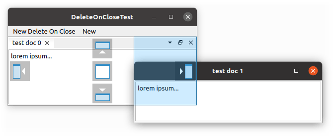
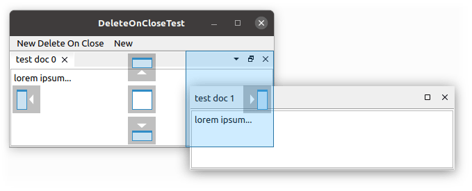
Custom Close Handling
Normally clicking the close button of a dock widget will just hide the widget and the user can show it again using the toggleView() action of the dock widget. This is meant for user interfaces with a static amount of widgets. But the advanced docking system also supports dynamic dock widgets that will get deleted on close. If you set the dock widget flag DockWidgetDeleteOnClose for a certain dock widget, then it will be deleted as soon as you close this dock widget. This enables the implementation of user interfaces with dynamically created editors, like in word processing applications or source code development tools.
When an entire area is closed, the default behavior is to hide the dock widgets it contains regardless of the DockWidgetDeleteOnClose flag except if there is only one dock widget. In this special case, the DockWidgetDeleteOnClose flag is followed. This behavior can be changed by setting the DockWidgetForceCloseWithArea flag to all the dock widgets that needs to be closed with their area.
Globally Lock Docking Features
It is possible to globally lock features of all dock widgets to “freeze” the current workspace layout. That means, you can now lock your workspace to avoid accidentally dragging a docked view. When locking wasn’t possible, users had to manually dock it back to the desired place after each accidental undock.
You can use a combination of the following feature flags to define which features shall get locked:
CDockWidget::DockWidgetClosableCDockWidget::DockWidgetMovableCDockWidget::DockWidgetFloatableCDockWidget::DockWidgetPinable
To clear the locked features, you can use CDockWidget::NoDockWidgetFeatures
The following code shows how to lock and unlock all dock widget features
globally.
DockManager->lockDockWidgetFeaturesGlobally();
DockManager->lockDockWidgetFeaturesGlobally(CDockWidget::NoDockWidgetFeatures);
Dock Widget Size / Minimum Size Handling
There are several CDockWidget mode enums to control how a CDockWidget is
resized and how the docking system handles the minimum size of a dockwidget.
The first one is the eInsertMode enum:
enum eInsertMode
{
    AutoScrollArea,
    ForceScrollArea,
    ForceNoScrollArea
};
The InsertMode defines how the widget is inserted into the dock widget, when you
call the CDockWidget::setWidget method:
DockWidget->setWidget(widget, CDockWidget::AutoScrollArea);
The content of a dock widget should be resizable do a very small size to
prevent the dock widget from blocking the resizing. To ensure, that a
dock widget can be resized very well, it is better to insert the content
widget into a scroll area or to provide a widget that is already a scroll
area or that contains a scroll area (such as an QAbstractItemView)
If the InsertMode is AutoScrollArea, the DockWidget tries to automatically
detect how to insert the given widget. If the widget is derived from
QScrollArea (i.e. an QAbstractItemView), then the widget is inserted
directly. If the given widget is not a scroll area, the widget will be
inserted into a scroll area.
To force insertion into a scroll area, you can also provide the InsertMode
ForceScrollArea. In this case a scroll area will also be created for content
widgets that are derived from QScrollArea To prevent insertion into a scroll
area, you can provide the InsertMode ForceNoScrollArea. In this case, the
content widget is always inserted directly.
A second enum, the eMinimumSizeHintMode defines, which value will be returned
from the CDockWidget::minimumSizeHint() function:
enum eMinimumSizeHintMode
{
    MinimumSizeHintFromDockWidget,
    MinimumSizeHintFromContent,
    MinimumSizeHintFromDockWidgetMinimumSize,
    MinimumSizeHintFromContentMinimumSize,
};
To ensure, that a dock widget does not block resizing, the dock widget
reimplements minimumSizeHint() function to return a very small minimum
size hint. If you would like to adhere the minimumSizeHint() from the
content widget, then set the minimumSizeHintMode() to
MinimumSizeHintFromContent. If you would like to use the minimumSize()
value of the content widget or the dock widget, then you can use the
MinimumSizeHintFromDockWidgetMinimumSize or
MinimumSizeHintFromContentMinimumSize modes.
Styling / themes
The Advanced Docking System supports styling via Qt Style Sheets. All components like splitters, tabs, buttons, titlebar and icons are styleable this way.
Default Style Sheet
The dock manager uses an internal stylesheet to style its components.
The library ships with a set of default Qt stylesheets located in the src/stylesheets directory supporting both light and dark themes.
By default, the dock manager automatically selects the appropriate stylesheet according to the application’s current color palette. When the application switches between light and dark mode (for example due to an operating system theme change), the corresponding stylesheet and icon set are applied automatically.
In addition, palette changes are propagated to all docking widgets, ensuring that palette-based colors are updated consistently.
The stylesheet selection behavior can be configured through CDockManager::setColorSchemeMode. Three modes are available:
| Mode | Description |
|---|---|
| FollowPalette (default) | Automatically selects the light or dark stylesheet based on the application’s current palette. |
| Light | Always uses the light stylesheet, regardless of the application palette. |
| Dark | Always uses the dark stylesheet, regardless of the application palette. |
Simply set the mode after creating the dock manager instance:
DockManager->setColorSchemeMode(CDockManager::ColorSchemeMode::FollowPalette);
Disabling the Internal Style Sheet
If you want to disable this internal stylesheet because your application uses its own, just call the function for settings the stylesheet with an empty string.
DockManager->setStyleSheet("");
or you can use the configuration flag DisableStylesheet to disable the internal stylesheet completely. This is useful if you want to use your own stylesheet and don’t want the internal stylesheet to be applied at all.
CDockManager::setConfigFlag(CDockManager::DisableStyleheet, true);
Using ADS on Linux
Supported Distributions
Unfortunately, there is no such thing as a Linux operating system. Linux is a heterogeneous environment with a variety of different distributions. So it is not possible to support “Linux” like it is possible for Windows. It is only possible to support and test a small subset of Linux distributions. The library can be compiled for and has been developed and tested with some Linux distributions. Depending on the used window manager or compositor, dock widgets
with native title bars are supported or not. If native title bars are not supported,
the library switches to QWidget based title bars.
- Kubuntu 18.04 and 19.10 - uses KWin - no native title bars
- Ubuntu 18.04, 19.10 and 20.04 - native title bars are supported
- Ubuntu 22.04 - uses Wayland -> no native title bars
Requirements
There are some requirements for the Linux distribution that have to be met:
- an X server that supports ARGB visuals and a compositing window manager. This is required to display the translucent dock overlays (https://doc.qt.io/qt-5/qwidget.html#creating-translucent-windows). If your Linux distribution does not support this, or if you disable this feature, you will very likely see issue #95.
- With ADS version v5.0.0 Wayland is supported. If you have problems with Wayland, then you should set the session type to x11:
XDG_SESSION_TYPE=x11 ./AdvancedDockingSystemDemo. You will find more details about this in issue #288.
Screenshot Kubuntu:
Screenshot Ubuntu:
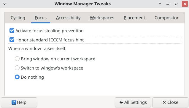
Manjaro xfce 25.0.1 and Xubuntu 24.04.2 issues
There is a known focus stealing issue with the xfce4 compositor reported in issue [#734]. This issue
can be solved by enabling the setting Activate focus stealing prevention. Settings > Window Manager Tweaks has a tab called Focus.
Selecting Activate focus stealing prevention and Do nothing for When a window raises itself, seems to mitigate the issue. Deselecting Enable display compositing on the Compositor tab, also works.
OpenGl + ADS
If you would like to use OpenGL widgets with ADS such as GLWidget, QML or QWebEngineView, then you need
to set QApplication::setAttribute(Qt::AA_ShareOpenGLContexts) before creating your application and your
widgets (see issue [#732])
int main(int argc, char *argv[])
{
  QApplication::setAttribute(Qt::AA_ShareOpenGLContexts);
  QApplication application(argc, argv);
  ...
}